For any online brand, the website design is the most important part. You don’t want a faulty website as it will compromise the growth of your business. There are many mistakes you can make that can turn your website into a disaster. From a friendly user interface to an efficient backend, you must do everything to ensure a smooth user experience. You must make sure that you’re doing everything right while designing your website otherwise it might jeopardize all your SEO efforts.
There are many wrongs and many rights when it comes to the design of a website. In this article, I have mentioned 10 things that you must avoid doing while working on your website. If you’re creating a new website, these tips will definitely come in handy. Even if you already have a website, it is never too late to make improvements for the good.
What to Do
Here is a list of things you can do to make your website design better.
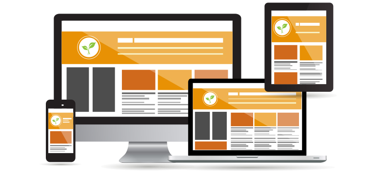
Make Responsive Designs
A responsive website will change according to the browser or device requirements in order to fit the screen better. This includes changes in the size of images, font etc. You must create a responsive website design as it makes user experience a lot better.

Make Your Website Faster
A fast website will definitely make your user happy. Studies show that people tend to leave websites when the pages take too long to load. By compressing image size and shrinking HTML, CSS, you can ensure an efficient website that will take much less time to load pages.
Publish Content Focusing the Visitor
A user is bound to leave a website sooner if he doesn’t find what he’s looking for. If you think like the visitor and publish the content your target audience would want to see, you will definitely engage the visitor for longer. This will make your website more likeable by the user.
Use White Space Appropriately
White space if the area of your website with no content whatsoever. Using white space appropriately means to allow your website to breath. Place the content and images in such a way that they don’t collide with each other or start overlapping. Having clear space between different components and content allows the user to see things more clearly.
Clear Navigation Menus
It can be frustrating for a user to have a hard time looking for navigation menus. You should make it a priority to place the menus in clear sight and make them easy to locate. This saves the user’s time and helps him navigate through the website easily.
What NOT to Do
Here is a list of things you must AVOID to enhance your website experience.
Never Under Pan
No amount of planning is too much when it comes to designing a website. You should carefully create plans for the pages, URLs, internal linking, content placement, etc. Basically, invest good thought on each and every aspect of your website.
No 404s
Seeing a 404 error will make a user jump right out of your website. Studies show that a user seldom makes an effort to resolve a 404 error and hence the bounce rate becomes high. You must make sure to redirect all the 404s appropriately to control the bounce rate on your website.

Clutter and Unclear Font
When the user doesn’t understand what he is seeing, he will definitely end up leaving. Ensuring clutter free webpages with carefully placed content allows the user to see things clearly. A nice and neat font style with appropriate size also serves the same purpose.
Grammatical Mistakes
Grammatical mistakes on a professional website can be a huge turn off for a potential customer. He will think of your brand as non-serious and might even think of it as a scam. Make sure that you should and look extremely professional to attract potential customers.
Poor Image Quality and Sizing
Poor quality of images and unsuitable sizing also points towards unprofessionalism. Your website visitor will only take you seriously when everything is on point and that includes all the content and images of the website.
I hope these tips will help you create an amazing and professional website for your business. This way your brand will get the boast it needs to take off.


